
Custom UI Controls
The AMAPNavi SDK supports full customization of UI elements in AMapNaviDriveView, AMapNaviWalkView, and AMapNaviRideView. You can modify both on-screen map elements and UI controls to create a navigation interface that matches your app's style and business requirements. This guide uses AMapNaviDriveView as an example.
AMapNaviDriveView consists of two layers:
- Map layer (bottom): The SDK draws map-based elements such as the vehicle icon, start and end points, traffic routes, turn arrows, electronic eye alerts, guide lines, and traffic lights based on route information.
- Widget layer (top): UI control elements such as junction views, traffic bars, overview buttons, and settings buttons.
This document focuses on customizing UI controls. For other customization options, see:
Show or Hide UI Elements
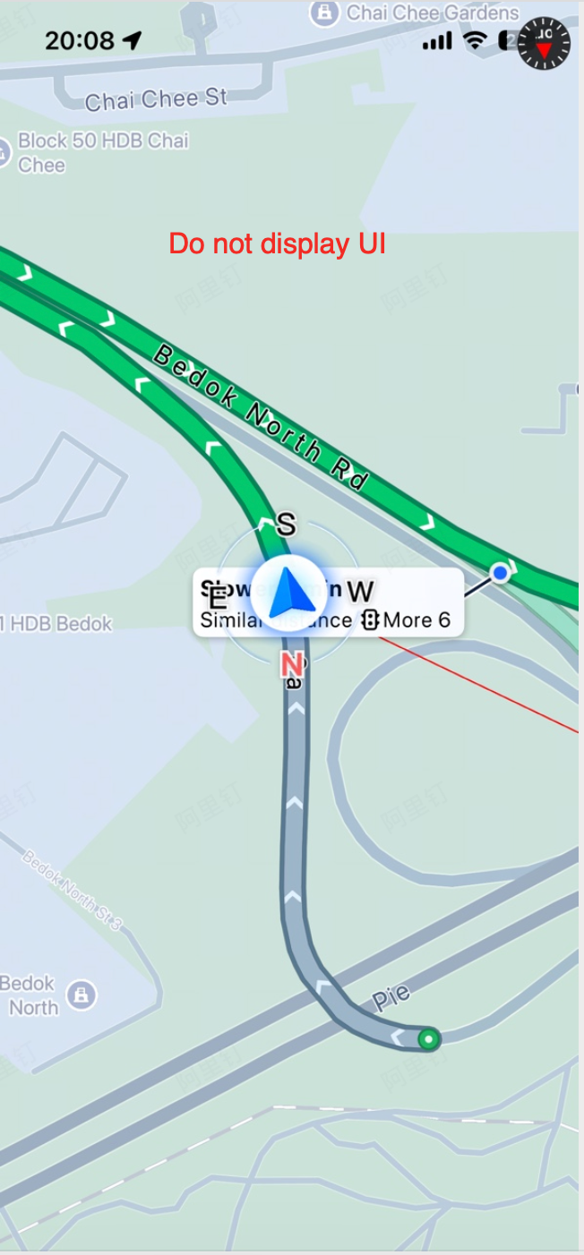
You can use the following property to show or hide all UI controls at once. For example, if you want to completely customize your UI layout, set showUIElements to NO.
/// Whether to show UI elements. Default is YES.
@property (nonatomic, assign) BOOL showUIElements;
When UI elements are hidden, you gain control over the map scale bar and view anchor point. You can adjust the scale bar position and the default display position of the vehicle icon in locked mode using the following properties:
/// Whether to show the map scale bar. Default is NO.
/// Note: This property only takes effect when showUIElements is NO.
@property (nonatomic, assign) BOOL showScale;

/// The origin position of the map scale bar.
/// Note: This property only takes effect when showUIElements is NO.
@property (nonatomic, assign) CGPoint scaleOrigin;

/// The view anchor point of the map. (0,0) is the top-left corner, (1,1) is the bottom-right corner.
/// Use this to change the default display position of the vehicle icon.
/// Note: This property only takes effect when showUIElements is NO. Available since 6.2.0.
@property (nonatomic, assign) CGPoint screenAnchor;
Additionally, the following API and delegate method are essential for creating a custom UI layout:
/**
 * @brief When in overview mode, call this function to display the route within the visible area
 *        (the area remaining after excluding EdgePadding). This ensures the route is not obscured
 *        by custom UI elements. For example, call this after an orientation change when
 *        showUIElements is NO (custom UI). Available since 6.2.0.
 */
- (void)updateRoutePolylineInTheVisualRangeWhenTheShowModeIsOverview;

<AMapNaviDriveViewDelegate>
/**
 * @brief When showUIElements is NO, the driving navigation view needs to obtain the visible area
 *        in real time, such as when switching to overview mode, during orientation changes, or
 *        when dynamically calculating the map zoom level.
 *        Note: This callback is only invoked when showUIElements is NO and may be called frequently.
 *        Avoid performing heavy calculations when obtaining the EdgePadding.
 * @param driveView The driving navigation view.
 * @return For example, (100, 50, 80, 60) means: the visible area is the driveView.bounds with
 *         100px top, 50px left, 80px bottom, and 60px right padding.
 *         The EdgePadding value is typically determined by your UI layout.
 */
- (UIEdgeInsets)driveViewEdgePadding:(AMapNaviDriveView *)driveView;
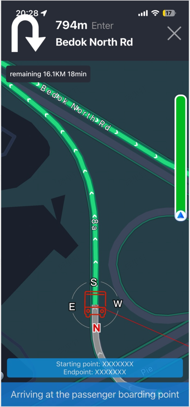
The following image shows an example result:
Junction View
You can independently control the visibility of the junction view using the following property:
/// Whether to show the junction view. Default is YES.
@property (nonatomic, assign) BOOL showCrossImage;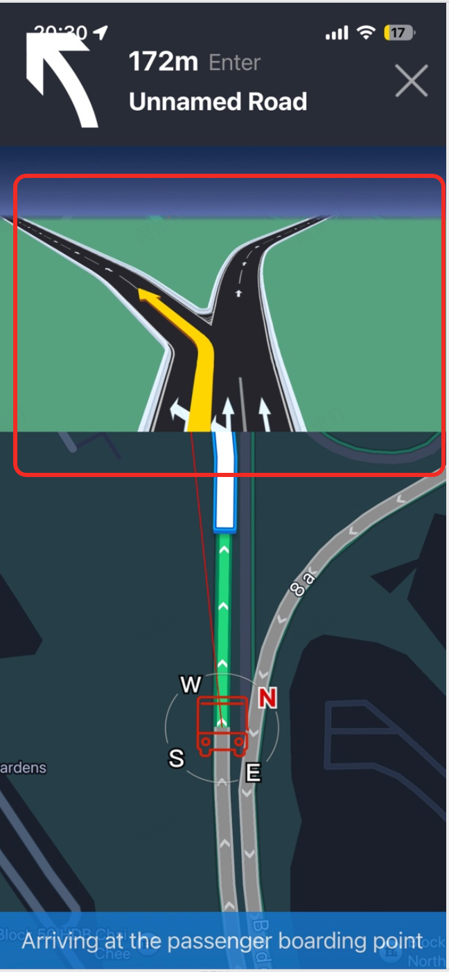
When the junction view is hidden, you can retrieve the current junction image information using Navigation Real-Time Data — Junction View and display the UIImage at a suitable position.
Traffic Bar
You can independently control the visibility of the traffic bar using the following property:
/// Whether to show the traffic bar. Default is YES.
@property (nonatomic, assign) BOOL showTrafficBar;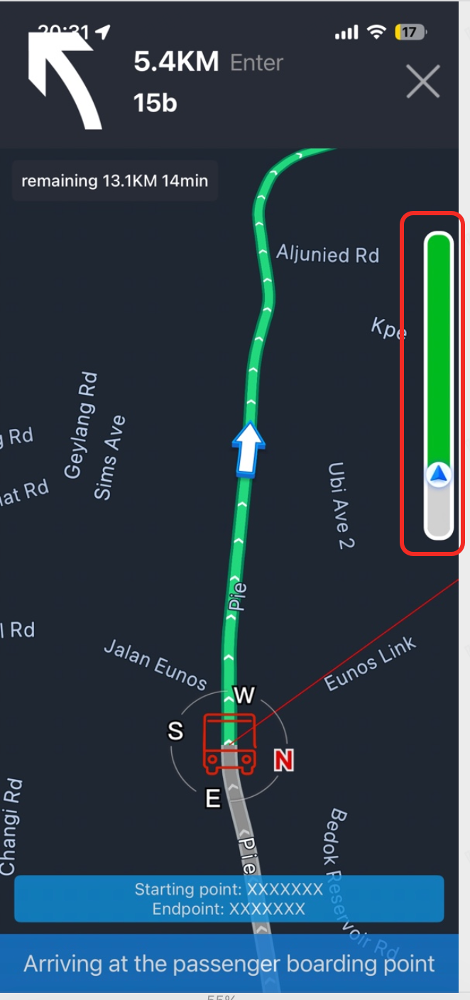
When the traffic bar is hidden, you can retrieve the traffic information for the current guided route using Navigation Real-Time Data — Traffic Information and draw your own traffic bar. Alternatively, you can use the provided AMapNaviTrafficBarView for layout customization, such as showing or hiding the full route, adjusting the border color and width, and customizing traffic status colors.
Button Controls
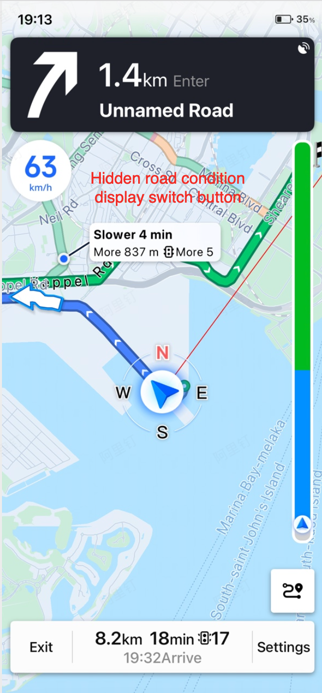
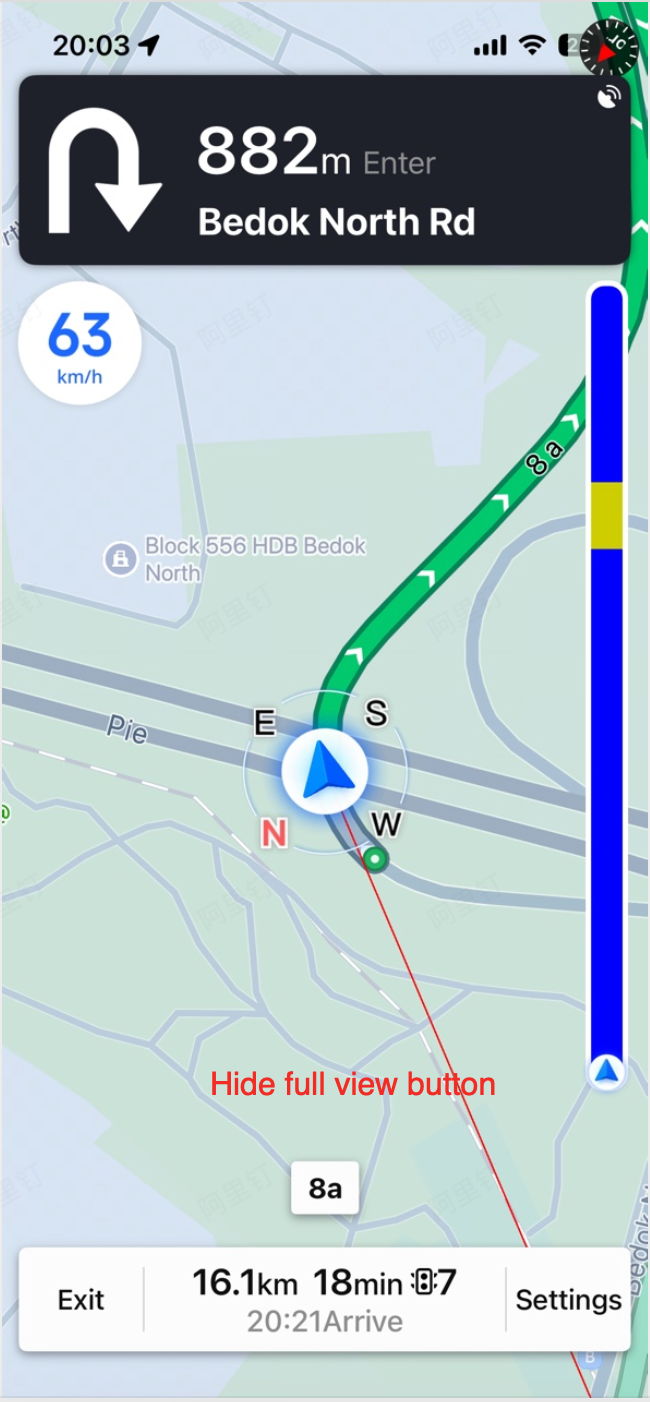
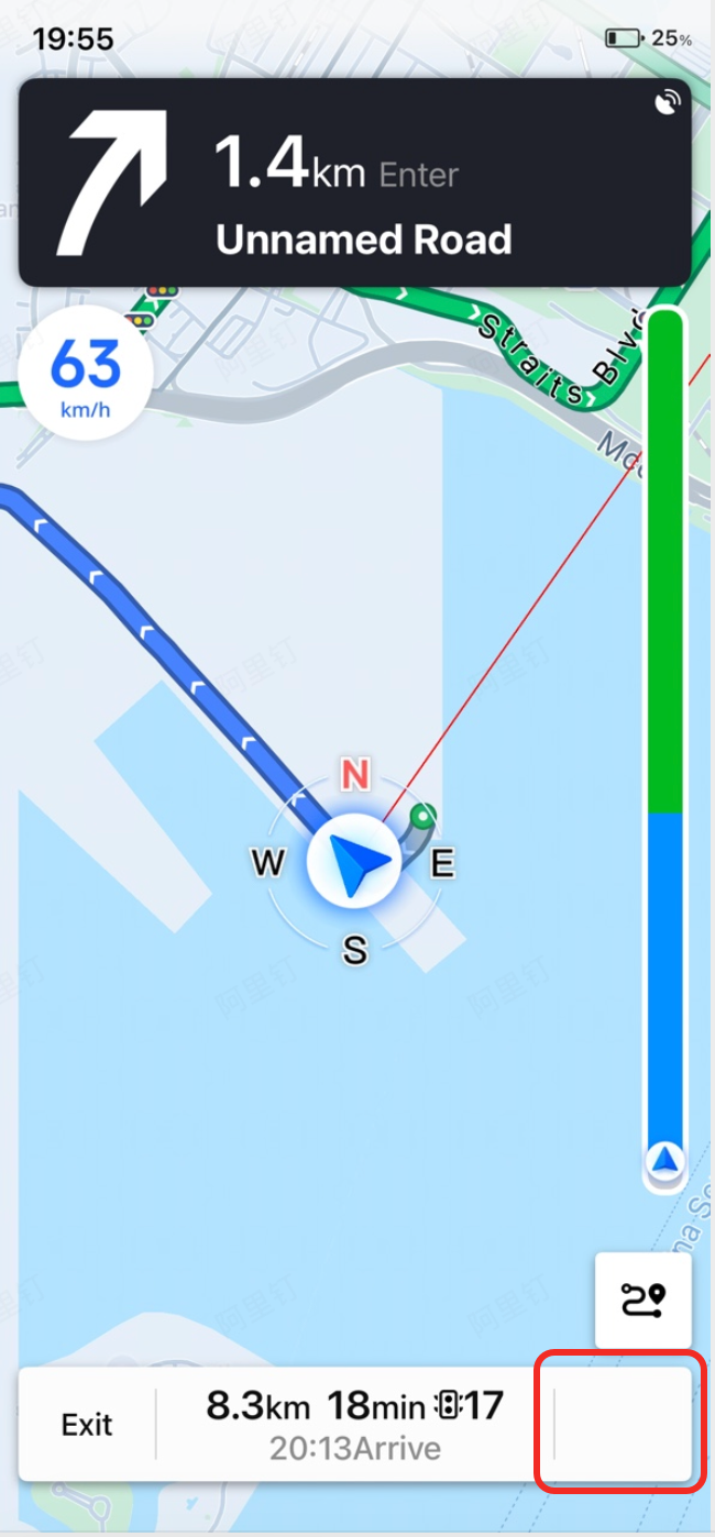
AMapNaviDriveView allows you to show or hide specific button controls, including the traffic toggle button, overview button, and settings button. Use the following properties:
/// Whether to show the traffic toggle button. Default is YES.
@property (nonatomic, assign) BOOL showTrafficButton;

/// Whether to show the overview button. Default is YES.
@property (nonatomic, assign) BOOL showBrowseRouteButton;

/// Whether to show the more (settings) button. Default is YES.
@property (nonatomic, assign) BOOL showMoreButton;
For example, if you hide the overview button and want to implement the overview/locked mode switching yourself, refer to Display Mode and Tracking Mode — Display Mode to set the showMode property. The following example demonstrates adding an event to a UISegmentedControl:
- (void)showModeAction:(UISegmentedControl *)sender
{
    // Change the display mode of the view
    switch (sender.selectedSegmentIndex)
    {
        case 0:
            [self.driveView setShowMode:AMapNaviDriveViewShowModeCarPositionLocked]; // Locked mode
            break;
        case 1:
            [self.driveView setShowMode:AMapNaviDriveViewShowModeOverview]; // Overview mode
            break;
        case 2:
            [self.driveView setShowMode:AMapNaviDriveViewShowModeNormal]; // Normal mode
            break;
        default:
            break;
    }
}